
| « 3 November 2004 « - Back | Archives | Next - » 5 November 2004 » |
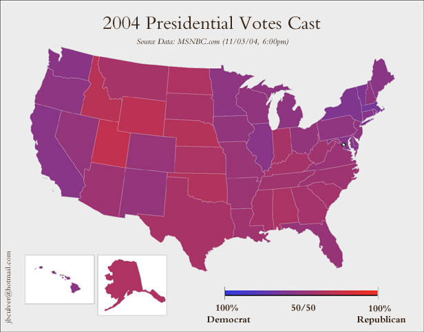
I've always wanted a map like this but never had the tools: Purple-USA from BoingBoing shows the state-by-state vote totals in a more data-rich way than simple blue-or-red. |
Links, exploration and synthesis from Steve Bogart  Photo by my wife RSS Feed / Atom Feed ARCHIVES Medley Seth/Entropy Genehack Kristie/BreachingTheWeb Knotted Knickers Kevin/GhostInTheMachine NRH/Leper Messiah JenB/Divinest Sense Bradlands Andy/Webcrumbs Lilly/GirlHacker rc3.org jjg.net Backup Brain More Like This Scalzi Flutterby WendellWit Q Daily News rebecca's pocket Laurel's TV Picks Recommended:  Randall Bramblett: Thin Places  Doctors, Professors, Kings & Queens: The Big Ol' Box of New Orleans  Tears for Fears: Everybody Loves a Happy Ending Ye olde Wishe Liste |
| « 3 November 2004 « - Back | Next - » 5 November 2004 » |