Design Commentary: Saint Louis Bread CompanyJuly 30, 1999
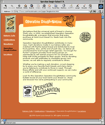
...not a full in-depth analysis, not a rigorous review, just some quick comments... Saint Louis Bread Company finally has a site (or, if they've had one before now, they're finally promoting it in the restaurant). Note: Outside Missouri, they're known as Panera Bread (now with a location in Cedar Rapids! Woohoo!). BreadCo (for short) is one of my favorite hangouts, with a nice wide-ranging menu and my favorite coffee drinks (their Caffe Mocha is currently my favorite drink in the world). They're also a company with a laudable social conscience: they donate money and the day's leftover bread (still good!) to local hunger relief agencies and food pantries. You can donate money to the cause ('Operation Dough-Nation') at the cash register. The site's front page is all graphics-based, which is quite pretty but not very user-friendly. The graphics should have ALT tags on them so people who don't load graphics can figure out how to get where they're going, and (more importantly) there should be text equivalents of the graphic links somewhere on the page (usually at the bottom, usually in a smaller font) for people who can't see the graphics at all.  The site's sub-pages are laid out well enough; navigating between them is easy and the page text is presented in a distinctively framed, graphically attractive manner. However, it's generally a bad idea to reduce the text size like they have -- the surfer is presumably happy with their browser's default text size, or they've changed it to a size they like; why put the majority of your content in a text size smaller than the size they're most comfortable reading? A good rule of thumb is to leave your main body text's size alone. There are exceptions, of course, but that's why it's just a rule of thumb and not a Law. Play with the font face all you like; the consequences of that aren't so bad if the size is left where the user likes it. Use style sheets to control font faces if you expect your audience to be relatively up-to-date browser-wise, otherwise you may as well stick with the FONT tag (for now).  Sadly, their Locations page is only useful if you have JavaScript turned on (which I usually don't) -- without it, the menu of locations doesn't even show up! Given that that sort of interface element is pretty trivial to implement without JavaScript, it's a rather unfortunate design choice. The site's also missing some information that I would have expected it to have:
Compared to many corporate sites, this is an okay start. I look forward to seeing how it evolves. -- Steve Bogart, bogart@nowthis.com
|